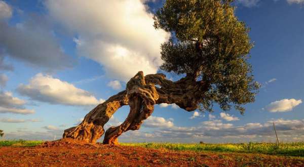
L’olivo detto anche ulivo è una pianta sempreverde appartenente alla famiglia delle Oleaceae. E’ molto diffuso nella zona mediterranea dove si concentra la maggior parte della produzione mondiale di olive.
L’olivo presenta delle foglie opposte di forma lanceolata e allungate, hanno un picciolo corto, la pagina superiore è di colore verde scuro, quella inferiore è bianco argento. I fiori sono piccoli ed ermafroditi di colore bianco e presenti in infiorescenze a grappolo che prendono il nome di mignole. Il frutto è una drupa di forma ovale, a seconda della varietà può avere varie dimensioni e un peso variabile dai 2 ai 6 grammi, è dalla polpa del frutto che viene ricavato il prezioso olio consumato nell’alimentazione mediterranea.
http://www.ortosemplice.it/frutta/olivo/
carnet de notes 458
by paolo rinaldi, rinaldi.paolo@fastwebnet.it, 0039.3483577940
@paolorinaldi, https://www.facebook.com/paolrin
ph felice bucci
voyages
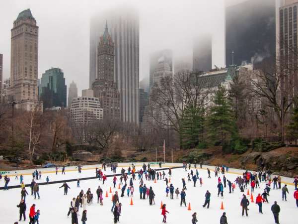
Central Park, New York
Arthur Nager – Central Park Photographs 2011–2018. "Central Park is clearly one of the most photographed locations in the world. Tourist photographs and cell phone images have captured each vista and monument, making it a challenge to reveal something new. From 2011 to 2018 I made numerous visits to the park without a plan, or preconceived notion of what I hoped to capture. I responded to the landscape and how it was defined by the changing light and the urban backdrop that borders the park".
http://www.nycgo.com, http://www.centralparknyc.org/
Dubai
Dubai è situata sulla costa del Golfo Persico degli Emirati Arabi Uniti, approssimativamente sul livello del mare. L'emirato di Dubai confina con Abu Dhabi a sud, Sharjah nel nord-est e con il golfo Persico lungo tutta la sua costa occidentale.
Hatta, un'exclave minore di Dubai, è circondata da tre lati dall'Oman, mentre confina con gli emirati di Ajman a ovest e di Ras al-Khaima a nord. Dubai si estende su una superficie di 4.114 km2, che costituisce un notevole ampliamento oltre la sua iniziale superficie di 3.900 km2 prima degli interventi di bonifica. Dubai si trova all'interno del deserto Arabico, tuttavia la topografia di Dubai è significativamente differente da quello della parte meridionale degli UAE, in quanto buona parte del paesaggio di Dubai è caratterizzato da dune sabbiose, mentre i deserti rocciosi caratterizzano tipicamente la parte meridionale del paese.La sabbia è costituita da coralli e conchiglie fratturati ed è fine, pulita e bianca. A est della città, le pianure costiere ricoperte dal sale, conosciute come sabkha, cedono il passo alle dune di sabbia. Più a est ancora, le dune diventano di dimensioni maggiori e a causa dell'ossido di ferro si tingono di una tonalità rossastra[2]. Il deserto pianeggiante lascia poi il posto alle Hajjar Mountains occidentali caratterizzate da un profilo frastagliato con vette che arrivano ai 1.300 metri, che costeggiano il confine di Dubai tra l'Oman e Hatta.
architecture
Two Stories Building / Oganic Design Architecture Studio, Lead Architect Hideo Kumaki, Saitama, Prefectura de Saitama, Japan, ph Yukinori Okamura
Text description provided by the architects. Two Stories building: exploring possibilities in commercial tenant buildings Commissioned design of this commercial tenant building was inspired by considering two main themes. First: how the design should relate to the neighborhood. We considered what aspects of the building should blend in and what statement it could make. As for the existing cityscape, until around the 1990s many buildings in this suburb featured conventional low gable roofs, hip roofs, or pavilion roofs. Flat roofs appeared in the past 15 years or so as condominiums, apartment complexes, and commercial buildings popped up here and there. Now these flat-roofed office buildings and condos are becoming more common here.
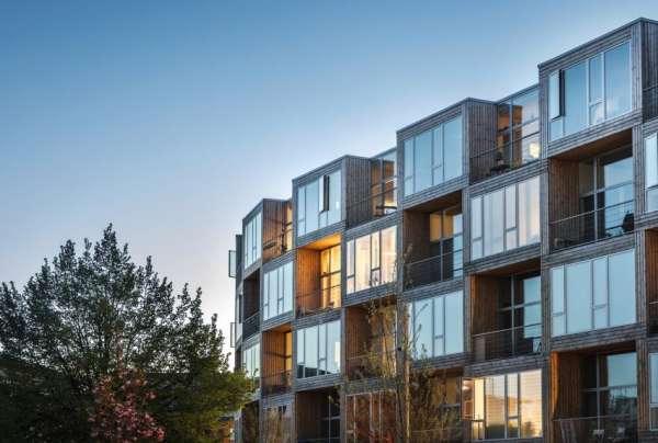
Bjarke Ingels' firm has completed Dortheavej Residence, an affordable housing development in Copenhagen made up of prefabricated modules stacked on top of one another. "The characteristic chequered pattern of Dortheavej is based on a singular prefab structure," explained BIG, which has its main office in Copenhagen, as well as studios in New York.
BIG designed the five-storey building for Danish non-profit housing association Lejerbo, as part of a masterplan developed by urban designer Jan Gehl. It creates 66 new homes for low-income residents ranging between 60 to 115 square metres in area. Each one has 3.5-metre-high ceilings, full-height windows and south-facing balconies. The building takes the form of a "winding wall", designed by the architects to resemble a chequerboard. The southern side of the apartments are fronted with floor-to-ceiling glazing and alternating balconies, while the northern facade is designed to look like a pattern of solid and void. The curve of the building creates a natural entrance plaza facing the street. At its base, a trio of large openings – each the size of one prefab module –create passageways through to a large secluded garden beyond.
.jpg)
Iridescent blue bricks and an art-deco-style cornice form the exterior of Damien Hirst's new headquarters in London's Soho, designed by architecture studio Stiff Trevillion.
London-based Stiff Trevillion designed the building as a flexible, creative workspace, as the architects didn't know at the time who would occupy it. Its aim was to create a memorable and characterful building befitting of the location, on the corner of Beak Street. The result attracted Hirst's attention. The British artist purchased the property from commercial developers Enstar Capital and LandCap for £40 million through his company Science. The 2,570-square-metre building, which comprises five storeys and a basement, will now act as the artist's main studio and art complex, as well as housing a branch of Japanese restaurant Sticks n Sushi. Stiff Trevillion chose glazed bricks in hues of sea blue and green for the building's facade. The architects completed the look with an art deco-style cornice, plus aluminium friezes and window surrounds, to give the illusion of deep relief and texture. At the base of the building, the bricks are a deep blue shade, while the main body boasts a lighter, sea green hue. The intention was to ground the structure and prevent it from appearing as one solid block, and to highlight the process of hand dipping each glazed brick.
http://www.stiffandtrevillion.com/
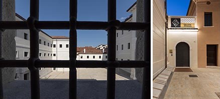
le ex carceri asburgiche di Treviso, ora Gallerie delle Prigioni
Da luogo di reclusione a luogo di apertura: è questa la trasformazione che ha coinvolto le ex carceri asburgiche di Treviso, ora Gallerie delle Prigioni. Questo per merito del complesso restauro – finanziato da Edizione srl, finanziaria del gruppo Benetton, e realizzato su progetto dell’Arch. Tobia Scarpa – che ha trasformato questi spazi in un laboratorio di idee, progetti e nuove sperimentazioni. In un contesto come questo, dove l’obiettivo era quello di valorizzare le caratteristiche identitarie dell’immobile ma allo stesso tempo renderlo innovativo dal punto di vista funzionale il contributo della tecnologia Vimar è stato fondamentale. Per permettere ai visitatori di godere appieno dei nuovi spazi, infatti, anche l’impianto elettrico, come le altre dotazioni, doveva rispondere agli standard più elevati.
http://www.vimar.com, http://www.trevisotoday.it/cronaca/prigioni-asburgiche-benetton-treviso-30-marzo-2018.html
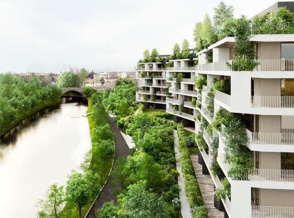
Stefano Boeri Architetti firma il progetto Ca' delle Alzaie a Treviso: tre edifici immersi in un giardino che si affacciano direttamente sul fiume Sile che attraversa la città
“Al posto di una fabbrica abbandonata, tre piccoli edifici sulla riva del fiume ospitano sulle loro facciate 120 alberi e 400 arbusti che da soli sono in grado di produrre più di 2,7 tonnellate di ossigeno all'anno. Una presenza discreta che ricompone il rapporto tra la città di Treviso, a due passi dalle antiche mura, e il fiume Sile”.
https://www.stefanoboeriarchitetti.net/
interiors
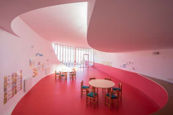
Municipal Toy Library of Dólar / Carquero Arquitectura / Calle Escuelas, 18512 Dólar, Granada, Spain, ph Carlos Koblischek
The building is distributed in only one plant, diaphanous and functional, organizing the service in the eastern part and the space of playroom opened towards the landscape in the western part.
Following the organic tracing, the main form is displayed to create an exterior space linked with the central core of games. The pavement of red and white linoleum establishes the zoning of the program. To provide with a major spatial quality, according to his function, the flat cover has been fragment following a compositive scheme, introducing natural light and ventilation to the principal core. Text description provided by the architects. We project the municipal playroom of Dólar (Granada) with a low budget (450 €/m2), subsidized with funds of agrarian employment for unemployed people. The plot is located in the south perimeter of this town of Guadix's region, with a form of arch that is opened to the rural landscape in the skirt of Sierra Nevada and that it´s leaned in one property line.
events
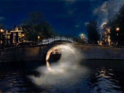
James Tapscott, a new artwork for the Amsterdam Light Festival
James Tapscott, the Melbourne-based Land & Light artist, is happy to announce plans for "TRAVERSION", an illuminated sculpture to be located at the iconic "Bridge of 15 Bridges" on the Herengracht Canal in Amsterdam from the end of November through to the end of January 2019.
TRAVERSION will be part of the seventh Amsterdam Light Festival, where local and international artists take visitors on a journey along 30 original artworks created especially for the event. Tapscott’s TRAVERSION will be composed of two vaulting arches of fine mist, one on either side of the famous bridge, illuminated with white light of subtly differing colour tones. “I want to give the feeling, when you pass through on a boat, that you are moving through different spaces, from cool to warm,” said Tapscott. ‘TRAVERSION' will echo the effect of looking through one bridge tunnel to the next. The site has a unique and interesting visual rhythm, as you look down each road or canal you see multiple bridges lined up in the distance – hence the name "bridge of 15 bridges". “My work is determined by the site itself,” said Tapscott. “The place determines the idea, the idea determines the materials and the materials determine the approach and its language”. Rarely using colour, Tapscott’s Land And Light art is particularly concerned with the ‘genius loci’, and the narratives that emerge at a littoral edge where land meets water and water meets light.
https://studio-jt.net/, https://amsterdamlightfestival.com/en
hotels, restaurants and bars
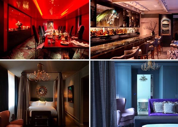
a Londra, nel quartiere di Fitzrovia, ha aperto The Mandrake, un lussuoso boutique hotel che esplora le virtù afrodisiache della pianta della mandragora da cui prende il nome
Deve il suo nome alla mandragora, pianta antropomorfa cui si attribuivano virtù magiche e proprietà afrodisiache, The Mandrake, lussuoso boutique hotel che ha aperto i battenti nel quartiere londinese di Fitzrovia e che rende omaggio alla guarigione, alle energie positive, ma anche agli intrighi. I suoi frequentatori sono persone dalla mente aperta e creativa: a loro, come in un breviario di magia, l’hotel di proprietà di Rami Fustok dichiara di rivelare il proprio capolavoro di famiglia, dove gli interni della sorella Tala riflettono le eccentricità del capoluogo britannico e dialogano con i quadri del fratello Malec e le surreali sculture della madre Bushra Fakhoury. Trenta camere, tre suite e luna surreale Penthouse all’ultimo piano. Le camere combinano arredi moderni e pezzi vintage e affiancano stranezze come piume, maschere e opere d’arte. (alessia delisi)
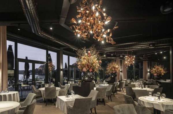
Restaurant Aan de Poel renewed their interior. Brand van Egmond creates eye-catching chandeliers that are attractive and exciting.
For the interior, two lighting collections were chosen: Kelp and Ersa. Several Kelp compositions were formed, in a warm red copper finish illuminating the black matt and spacious dining room. The Kelp collection, designed by William in 2014, is inspired by the seaweed kelp. The sparkling red copper intrigues like a crackling open fire and therefore evokes a dreaminess atmosphere.
https://brandvanegmond.com/it/, http://www.aandepoel.nl/
design
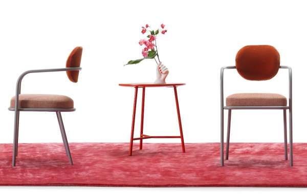
Ula di MY home collection. Leggerezza e minimalismo per la nuova seduta disegnata da Serena Confalonieri
La ricerca dell’originalita%u0300 prende forma nell’estetica della nuova seduta Ula disegnata da Serena Confalonieri per MY home collection. Ula predilige pulizia geometrica e volumi ‘sottili’ per inserirsi in modo versatile nella casa contemporanea. Il tubolare in acciaio laccato disegna lo schienale e le curve dei braccioli che piegano verso terra fino a diventarne le gambe anteriori, donando cosi%u0300 grande leggerezza alla seduta che risulta quasi sospesa.
http://www.myhomecollection.it/
http://www.serenaconfalonieri.com/
![]()
Glas Italia, SHIMMER coffee table exhibited in New York at "SATURED: THE ALLURE AND SCIENCE OF COLOR", Cooper Hewitt, New York through January 13, 2019
http://www.glasitalia.com, https://www.cooperhewitt.org/channel/saturated/
.jpg)
il silenzio dei colori, bottiglie in vetro, glass bottles by Matteo Thun for Venini
La collezione Il Silenzio dei Colori, composta da quattro diversi set di oggetti in vetro, è un omaggio al processo di produzione del vetro. il fuoco trasforma la materia prima in oggeti vivi. l velocità li trasforma in forme pure. il colore ne rende la bellezza fragile e ik trattamento visivo trsparente. una sorpres controllata grazie all'esperienza dei soffiatori di vetro Venini.
http://www.matteothun.com, http://www.venini.com
left, Giano by Alice Vitale, The Gallery Brussels
Giano consits of three different elements, each with its own specific identity, all lying on a single base. thanks to its multiple configurations, it is free from preconceived interpretations, which allows its very nature to take shape and morphe shape. Giano can thereforebe intrpreted as a decorative item, a vase or open composition.
http://thegallerybruxelles.com/
right, design by Claire Malet at Vessel Gallery, London
Malet is an artist who works with all forms of metal, from the precious to the recycled, to create unique art works that are inspired by the textures, colours and shapes that are found in our natural habitat and surrounding landscapes. None of these observations however, are about trying to copy nature, Malet’s aim is to capture a sense of it and create her response to it. Malet's works can be found in various museums and galleries including the V&A, National Museum Wales and the Manchester Art Gallery
.http://www.clairemalet.com/, http://www.vesselgallery.com/
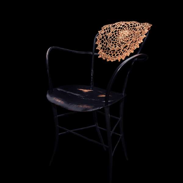
Antimacassar doily front, Ruben van Megen
Ruben van Megen si è laureato nel 2012 allsign Academy di Eindhoven eRuben van Megen graduated in 2012 from the Design Academy Eindhoven. Upon graduating, he started working as a self employed interior and furniture designer. Ruben van Megen stands forhigh end design and the use (and development) of new … The design Café 6116 was honoured with a Red Dot Award (2017) di design di alta gamma, grazie all’utilizzo di nuovi materiali e di tecniche innovative. Nel 2017 ha vinto il Red Dot Design Award e il suo progetto per il tavolo Café 6116 è in lizza per i .http://www.rubenvanmegen.nl/it/
art
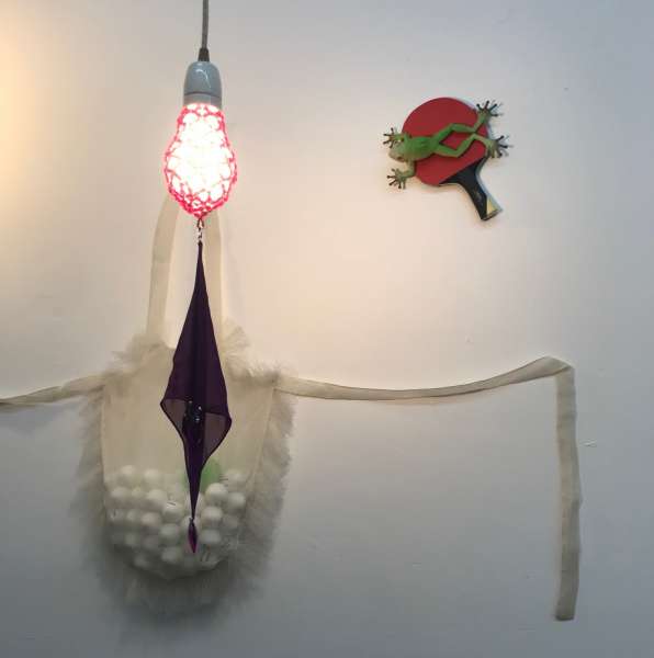
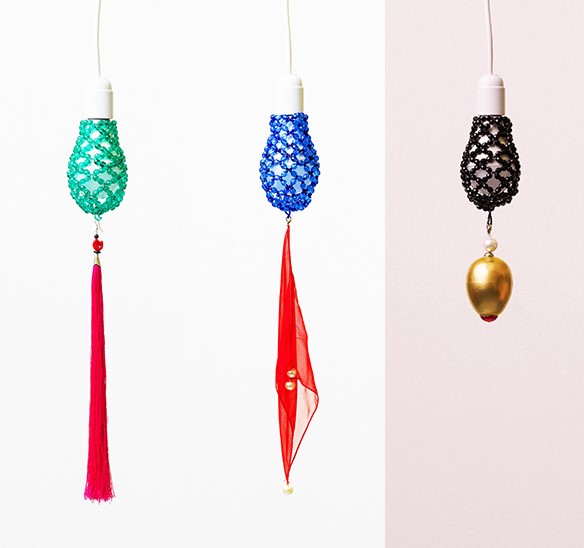
cinzia ruggeri, gioielli per lampadine,
16 rue Alfred de Vigny, Paris
https://www.google.it/search?q=cinzia ruggeri&tbm=isch&tbo=u&source=univ&sa=X&ved=2ahUKEwiw5_a7hZPeAhUFxhoKHdy0A_AQsAR6BAgGEAE&biw=950&bih=896
http://www.federicovavassori.com/
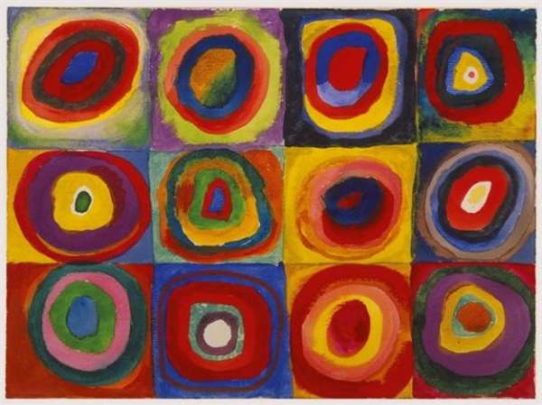
Wassily Kandinsky’s art explored the relationship between color and its viewers. He eschewed the grays, browns and blacks of Cubism, embracing color as the primary vehicle for expression. In doing so he completely separated painting from a need to depict a subject. The goal of Kandinsky’s art was to capture music in a plastic medium, to evoke the same feelings a piece of music could evoke through shades and hues.
luci/lumières
In occasione dell’edizione 2018 dei Brera Design Days, Foscarini ha presentato BE/COLOUR!, un incontro con Ferruccio Laviani, Pietro C. Marani, Carlo Urbinati sul tema del colore
La passione per il colore non è una novità per Foscarini, che ha sempre riservato un ruolo di primo piano a questo importante elemento del progetto, costitutivo e non accessorio. E intende ora riprendere ed approfondire questo tema, mettendosi in gioco senza remore su lampade diventate iconiche grazie alla loro inconfondibile linea e personalità, con BE/COLOUR!, una nuova capsule collection: firmata da Ferruccio Laviani. La collezione reinterpreta in chiave cromatica alcune tra le lampade più amate, tra cui Twiggy, Binic, Magneto, Bahia e Gregg, svelandone una personalità inedita. Come in una maison di alta moda, il gioco di accostamenti e contrasti cromatici rivela dettagli, svela un carattere, enfatizza e valorizza l’anima di un modello, mostrandolo sotto una luce totalmente nuova.
.jpg)
left, Sebastian Wrong’s Filigrana series of pendant lights are part of an exciting new collection of designs by iconic British design brand Established & Sons.
https://www.archiproducts.com/en/news/sebastian-wrong-for-established-sons_57742
right, Designer Rick Tegelaar explains how the Meshmatics Chandelier he developed at university became a Moooi product in this movie in our Design Dreams series for the Dutch brand. The wire structure reflects light emitted from an LED source concealed within a smaller gold dome at the base of the chandelier.
http://ricktegelaar.nl/, https://www.moooi.com/sites/default/files/press-files/meshmatics_chandelier.pdf?1529333785
photos
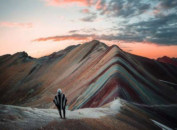
a shot of rainbow mountain in peru by @conormccann. the photobox instagram photography awards (PIPA), category travel, drew entries via instagram asking users needed to post their entries with the hashtag #thepipas2018.
mostre/exhibitions
etc.
Memphis designs fill Raquel's Dream House in New York
the Raquel's Dream House pop-up is the brainchild of art collector Raquel Cayre.Raquel’s Dream House is a month-long initiative proposed by Raquel Cayre that re-examines traditional methods of presenting, viewing and experiencing design as well as its corresponding modes of display. The selected contributors, designers and artists represent Raquel’s ambition not simply to challenge pre-existing models, or even contradict them, but to “abolish their rules by playing with them. An adventure of mixed tenses and reconciled opposites, Raquel’s Dream House coheres in the materia prima of design. Design conceived as an alchemical vocabulary for working and inhabiting. A room as a way of seeing.
online weekly magazine 29/10/2018
(travel, viaggi, architettura, interni, design, hotels, ristoranti, bar, luce, arte, mostre, foto, fashion, installazioni, musei, teatro)
è stato inviato a 15288 recipients/indirizzi
and posted to social networks:
facebook, twitter, linkedin and viadeo